Wednesday , March 18 , 2009

Posted by:
James
My
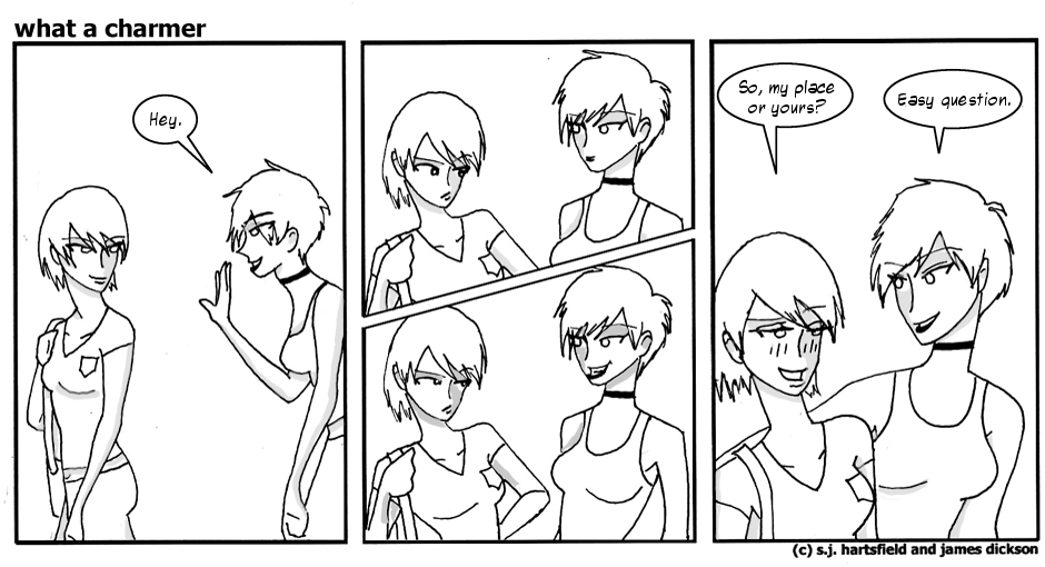
goodness, Brighton has a way with the ladies. Didn't even ask her name. Sort of sets a fellow to wondering why, if it was that easy, hasn't she gotten any in the past two years? Plot hole, or plot
point? I'll leave you readers to decide.
Anyway, the site tweaking continues as per my usual slow pace. The hyperlinks have (hopefully by the time this is posted) been changed from the Godawful default blue/purple to something that feels a bit more...
in line with the overall aesthetic of the site. Also, their underlining has been removed. It just wasn't very pretty.
In any case, I continue to marvel at the miracle of cascading style sheets. They make the webmastering bit so much easier than it rightfully should be. I'm sure I'll look back on this post at some point in the distant future--a future when CSS has gone the way of punch cards and the dodo, and all web design is performed by plugging a wireless adapter into your brain to will, godlike, the raw tridimensional gamespaces of the Global Matrix into a form of your choosing--and scoff at my juvenile enthusiasm.
"Ha!" I'll say, shaking my white-haired head, the adapter jacked into the base of my skull glittering like a firefly as I will another website into being with my mind. "How foolish I was then."
-James

Posted by:
Sarah
First post! Well, first of mine, anyway. Hi guys, I'm Sarah. I draw the shitty pictures.
So... um, yeah. Here's the comic for today. You might notice that Brighton has undergone some drastic changes since the first comic. That's mainly because I
fucking hated the way she looked in the early comics. And because I didn't want it to be quite so obvious that she was just what I'd look like if I was skinny. Hehe.
Hopefully the art will continue to grow and evolve (that is to say, to get better) as the comic goes on.
For now, it continues to look like a retarded five-year-old drew it. Cheers!
~sjh

 Posted by:
 Posted by: