 Posted by:
  Posted by:
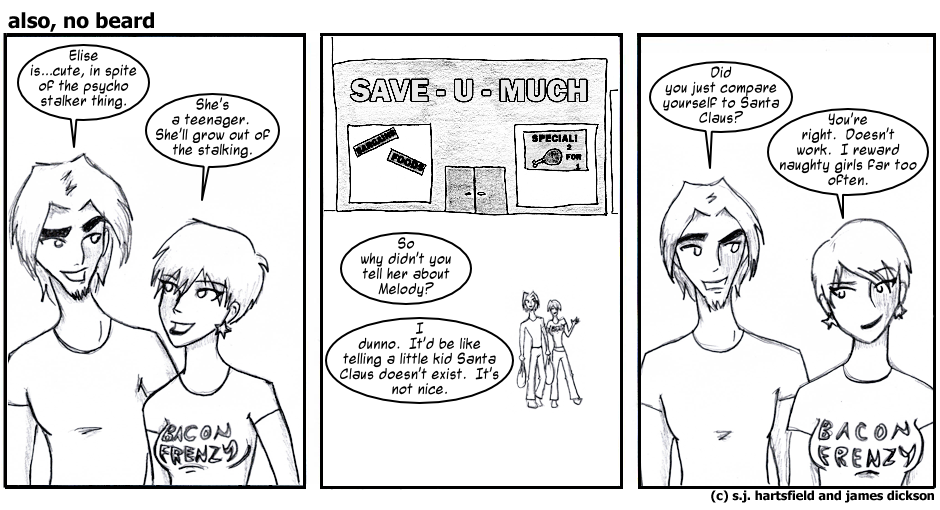
I really like the way the strip looks today, stylistically. I always dig stuff that has a sketchy, organic quality, so that's probably a big part of it.
It's fun watching Sarah experiment. I find out about art changes only slightly before you lot (by which I mean our faithful readers) simply by virtue of the fact that I must letter each comic before it goes up. I think pretty much the only things that have remained constant from the start of this strip are Kent's eyebrows, which he appears to have stolen from Lee Pace. And that is awesome.
As a side note, I didn't overwrite the holy bejeezus out of this strip, which I'm pretty proud of. But that's neither here nor there.
You may have noticed that there have been even more changes to the site instituted since last week. I've added a little module full of links, primarily to webcomics Sarah and I read, directly below this section. I threw in the link to my personal blog for the hell of it, and as such I guarantee no steady updates to it. The other changes I made are largely cosmetic and don't bear much explanation.
Once more, though, I am forced to marvel at the wonders of CSS. It helps accomplish so ridiculously much so simply.
What all this comes down to is that everything is continuously improving around here. The art, the writing, the site itself, it's all being ever-so-slowly sanded and polished. I'd like to say it's all for you--it is, partly--but mostly it's because we're hopelessly obsessive like that.
-James