


 Posted by:
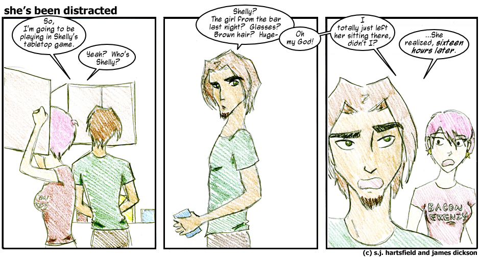
I'm glad Brighton didn't forget completely. That would've been very awkward. It's also heartening to see that she has the good graces to be sorry, even belatedly so.
In other news, I'm getting ever better at using Inkscape. See, there's bold text and normal text in that last bubble. That's technological advancement, that is.
In other, other news, the kind that you all probably care about, I'm going to be getting the About page up sometime today! It's all designed and written and ready to go, I just need to make sure that everyplace that's supposed to link there does, then I can upload it. There's not really a lot to be said about it other than that. It turned out to be pretty simple in the end. It's got some information on the comic, what it's about, what it's not about, and then it's got a couple blurbs on Sarah and I. Basic stuff.
I also let you other nascent webcomickers in on what the font I use for our speech bubbles is, in case you are positively dying to know. I know that's not important for most folks, but it kinda was for me, right there at the start. I've never liked the idea of using a system-standard font for a webcomic. It just seems strange and stilted. There are some comics that do and get away with it by virtue of being so damn good otherwise--Penny Arcade in its early years and Keychain of Creation in general both feature Comic Sans, which I normally loathe but am willing to make allowances for in those two instances because it's the closest thing to an appropriate use of that font that I can think of. I figure that as a fledgling comic we should use whatever edge we can get, though, and so here we are with Mighty Zeo 2.0 from Blambot Comic Fonts and Lettering.
I can't believe I just prattled on for a solid paragraph about fonts. I might just be the biggest geek I know.
-James .
Best viewed with
.
Best viewed with  .
Subscribe to our RSS feed at
.
Subscribe to our RSS feed at  .
.